Interior Design Trends 2026–2027: A Post-Exhibition Analysis of Art Basel Miami, Design Miami & WestEdge LA
- Ekaterina Baklan
- Dec 15, 2025
- 4 min read
Updated: Dec 17, 2025
A designer’s reflection on tactility, immersion, heavy minimalism, and interiors as systems of recovery
Design exhibitions are over, the year is coming to a close, and this in-between moment — somewhere between reflection and anticipation — feels like the right time to pause and observe.
Not as a report, but as a reflection on where interior design is heading overall.
These signals resonate with what is often described as interior design trends Art Basel Miami 2026–2027, yet they extend far beyond exhibition walls into everyday architectural practice.
This direction felt especially clear while visiting WestEdge LA 2025 and Miami Art Week, including Art Basel and Design Miami.
It’s important to say this upfront: exhibitions don’t create trends — they reveal the direction the industry is already moving in.
As a designer, this shift deeply resonates with me.

Key signals shaping interiors for 2026–2027
(with interior design trends Art Basel Miami 2026–2027 as a cultural reference)
Across exhibitions and the broader editorial landscape, several changes feel especially noticeable:
fewer fast-aging, surface-level design decisions
a return to craftsmanship, material honesty, and visible process
a growing emphasis on safety and restoration: interiors increasingly function as systems of recovery rather than performance
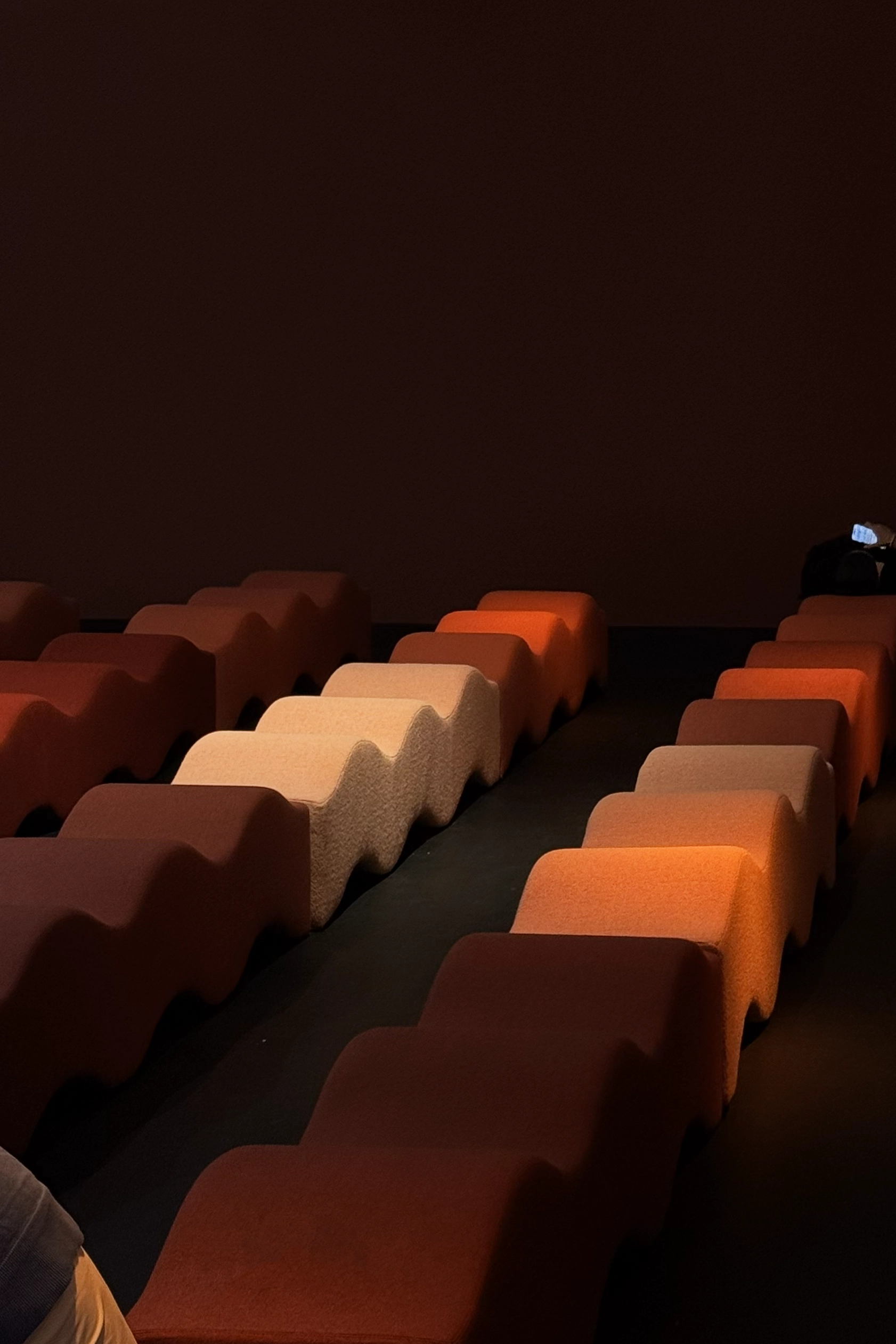
1. Fatigue with Overly Rounded Upholstered Furniture
— with Nuance
The trend toward excessively rounded, “marshmallow-like” upholstered furniture appears to be gradually losing its dominant position.
Not curved language as a whole — but forms where softness itself becomes the primary concept.
Across recent exhibitions and editorial selections, there seemed to be fewer large-scale upholstered pieces relying on visual softness alone. Instead, attention has shifted toward construction logic, material weight, and structural clarity — particularly in substantial furniture pieces.
This does not signal a rejection of organic language. On the contrary, curvature is becoming more intentional — but it is migrating away from upholstery and into more architectural categories.
Today, curved language appears most clearly in:
chairs and stools
cabinetry and storage systems
tables and structurally rigid furniture
decorative and architectural elements
In these categories, curvature feels earned.
It emerges from material exploration, craftsmanship, and structural resistance — not from softness used as a shortcut to comfort.
Playful or naïve imagery hasn’t disappeared. Floral motifs and childlike gestures remain present — but only when supported by material density, artisanal execution, and clear construction logic.
Softness is no longer a substitute for architectural thinking.
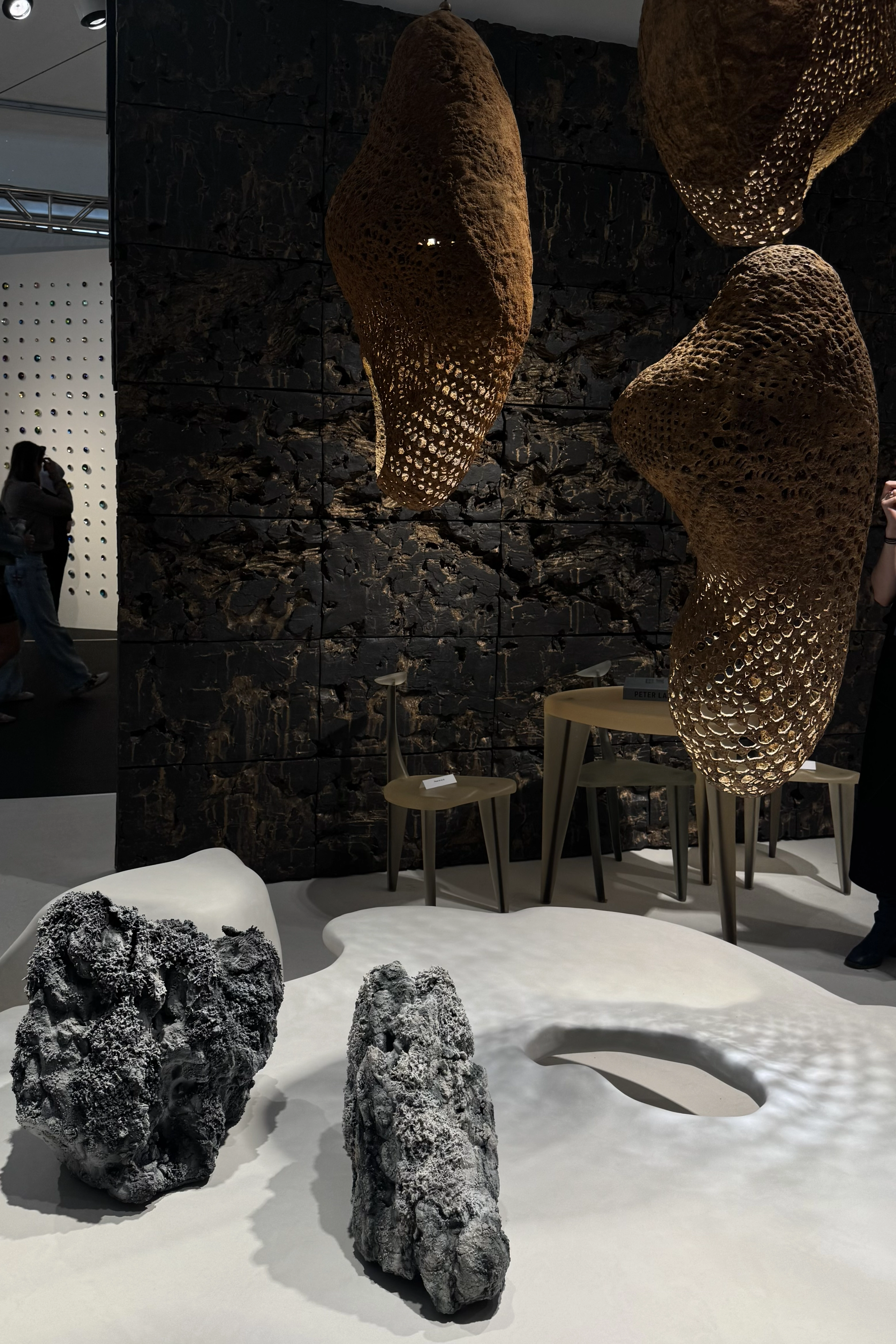
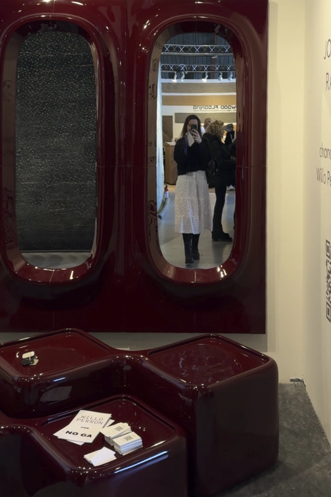
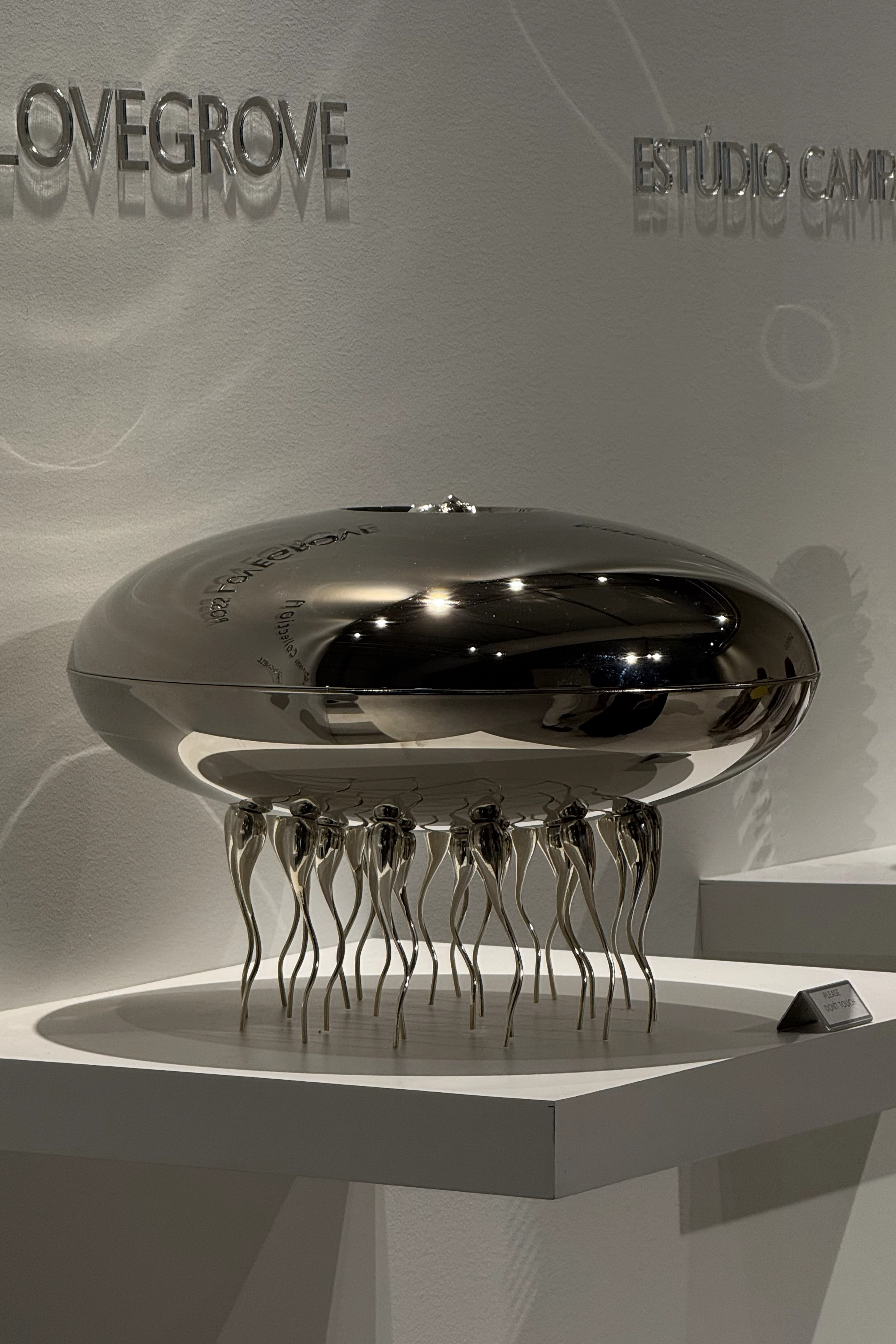
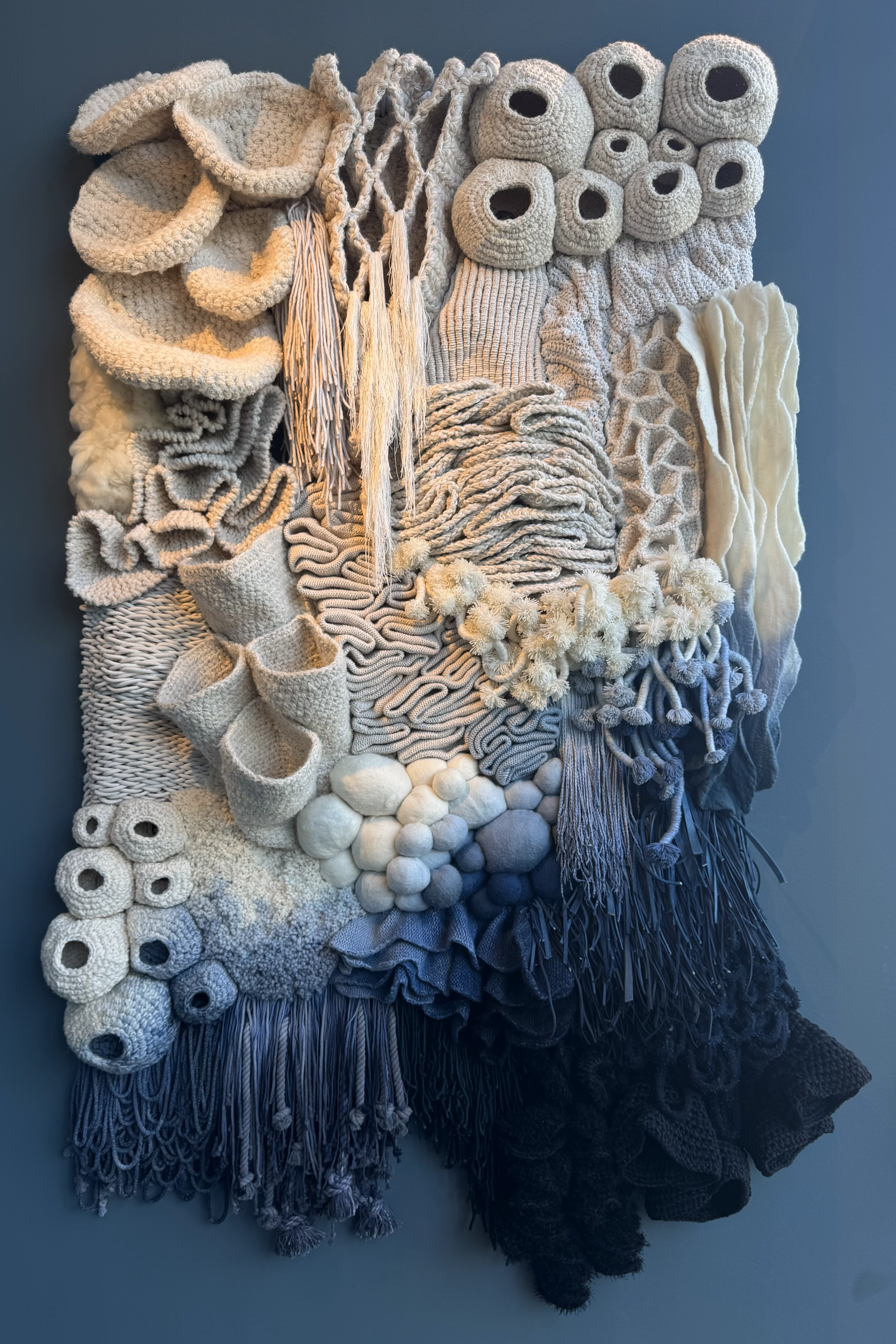
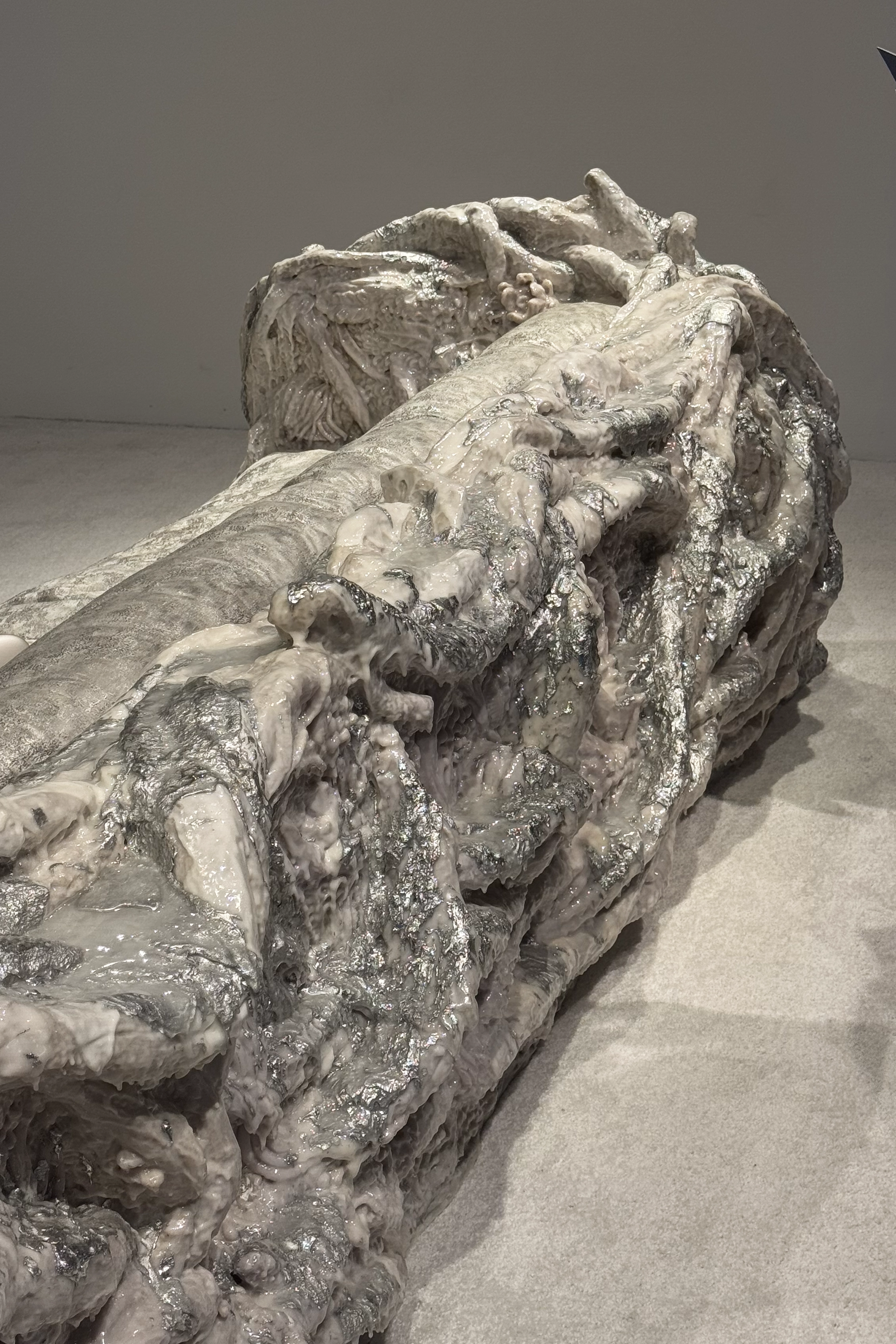
2. Tactility as the New Luxury Craft Revival in High-End Interiors
Smooth no longer automatically equals expensive.
Luxury interiors are increasingly defined by tactility and material presence:
live-edge wood
stone and minerals with raw or unfinished areas
metals bearing visible handmade traces
sculptural furniture that feels carved rather than manufactured
surfaces resembling coral, minerals, or shells
Tactility has become a new language of luxury — one rooted in time, labor, and physical engagement with material.
➤ Design Miami, in particular, highlighted this through collectible design and art objects, where material presence outweighed formal perfection.
3. Color: From Oxblood to Butter Yellow
Color palettes are becoming deeper, warmer, and more atmospheric.
Burgundy, oxblood, and wine tones continue to appear in high-end contexts, especially in moody, warm interiors.
At the same time, butter yellow and warm ochre tones are emerging as a notable counterbalance — soft, luminous, and quietly optimistic.
What’s important is that color is no longer treated as an accent.
It becomes atmosphere.
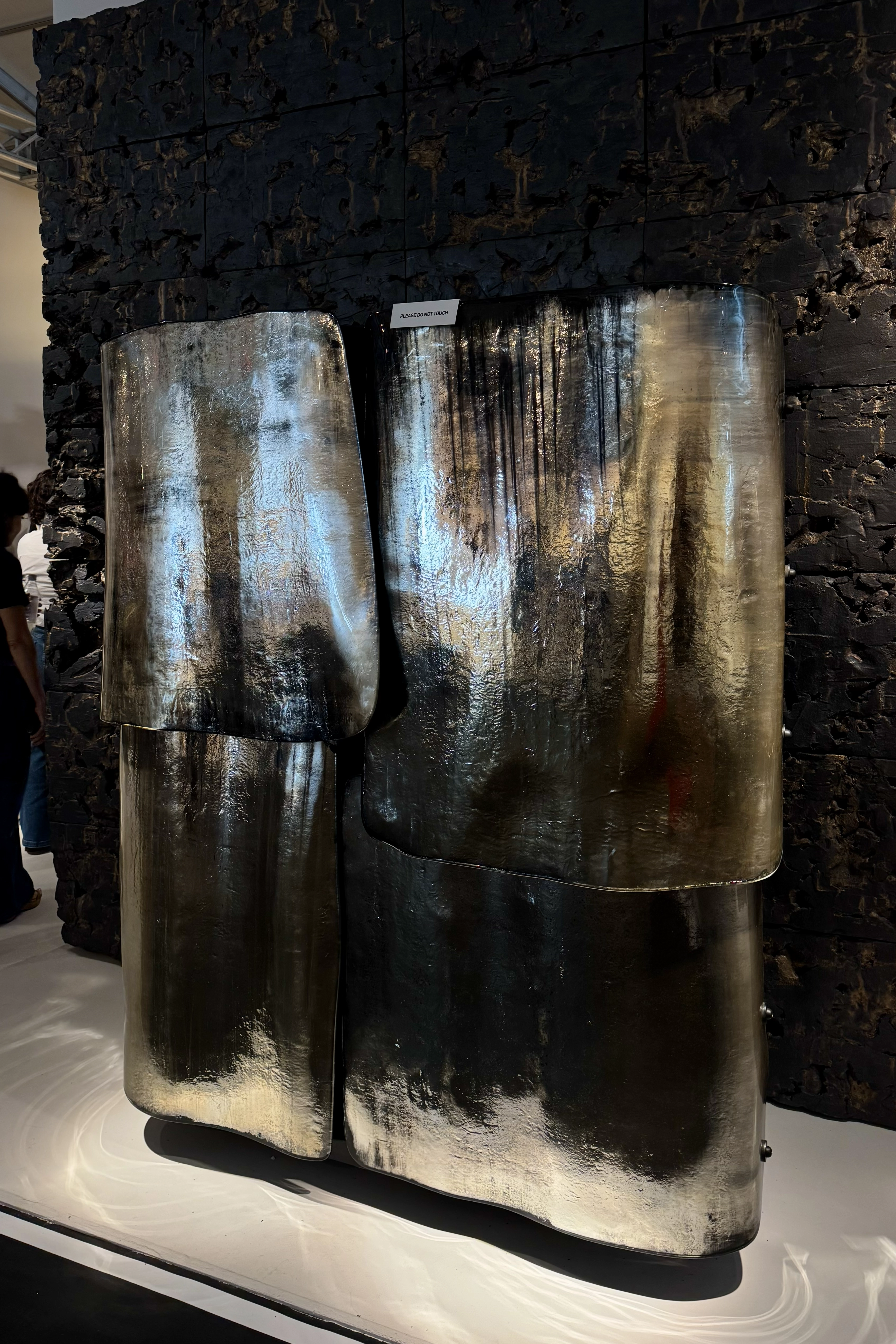
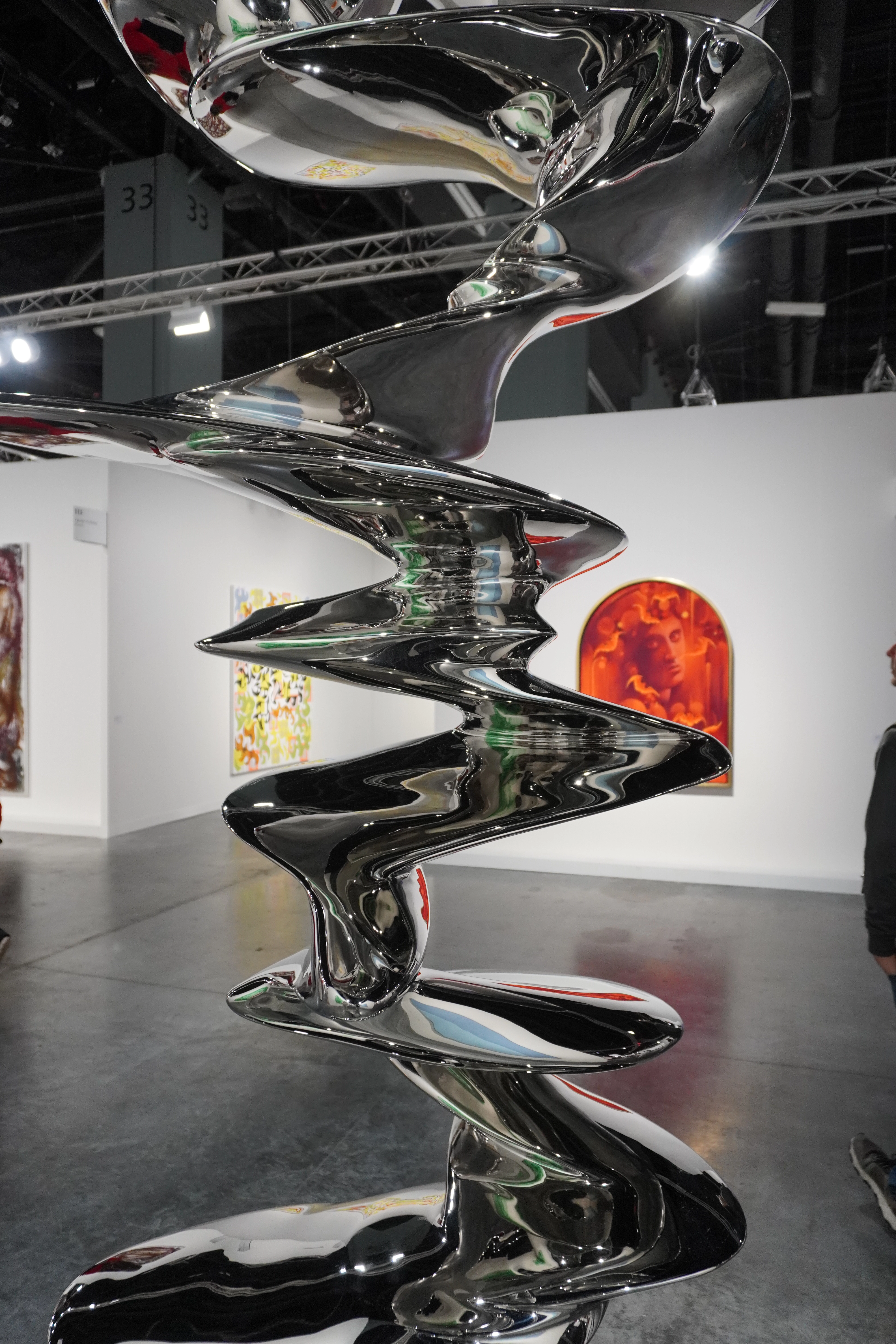
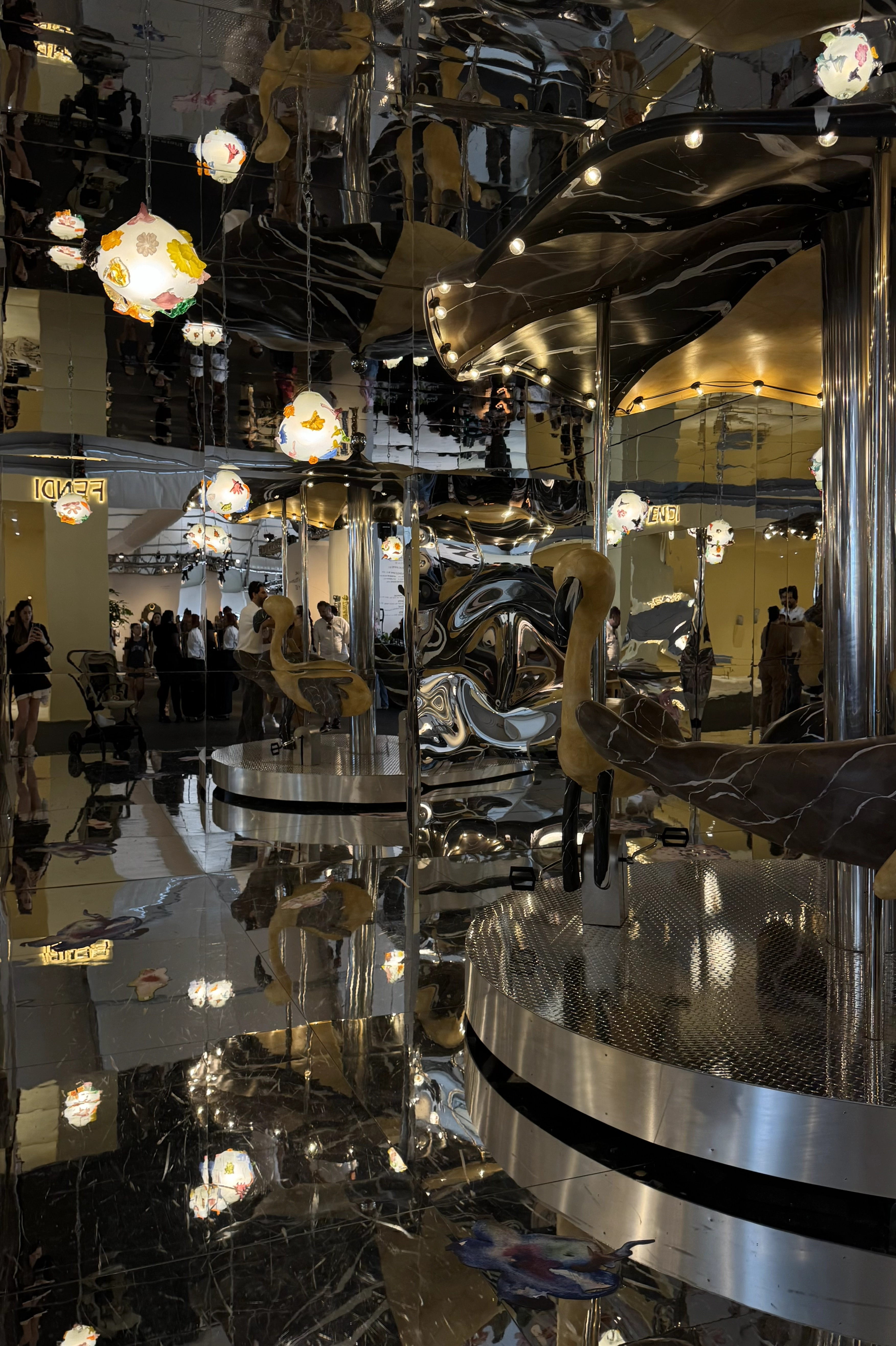
4. Metals: Chrome, Silver, and Cool Reflections
After a long period dominated by warm brass and gold tones, cooler metals are re-entering the conversation.
Returning materials include:
chrome
nickel
cool, reflective silver finishes
We see polished chrome objects, “liquid silver” textures, reflective glass pairings, and mirrored elements used within immersive environments.
This isn’t gloss for the sake of gloss —
but a deliberate contrast to warm, tactile, handcrafted materials.
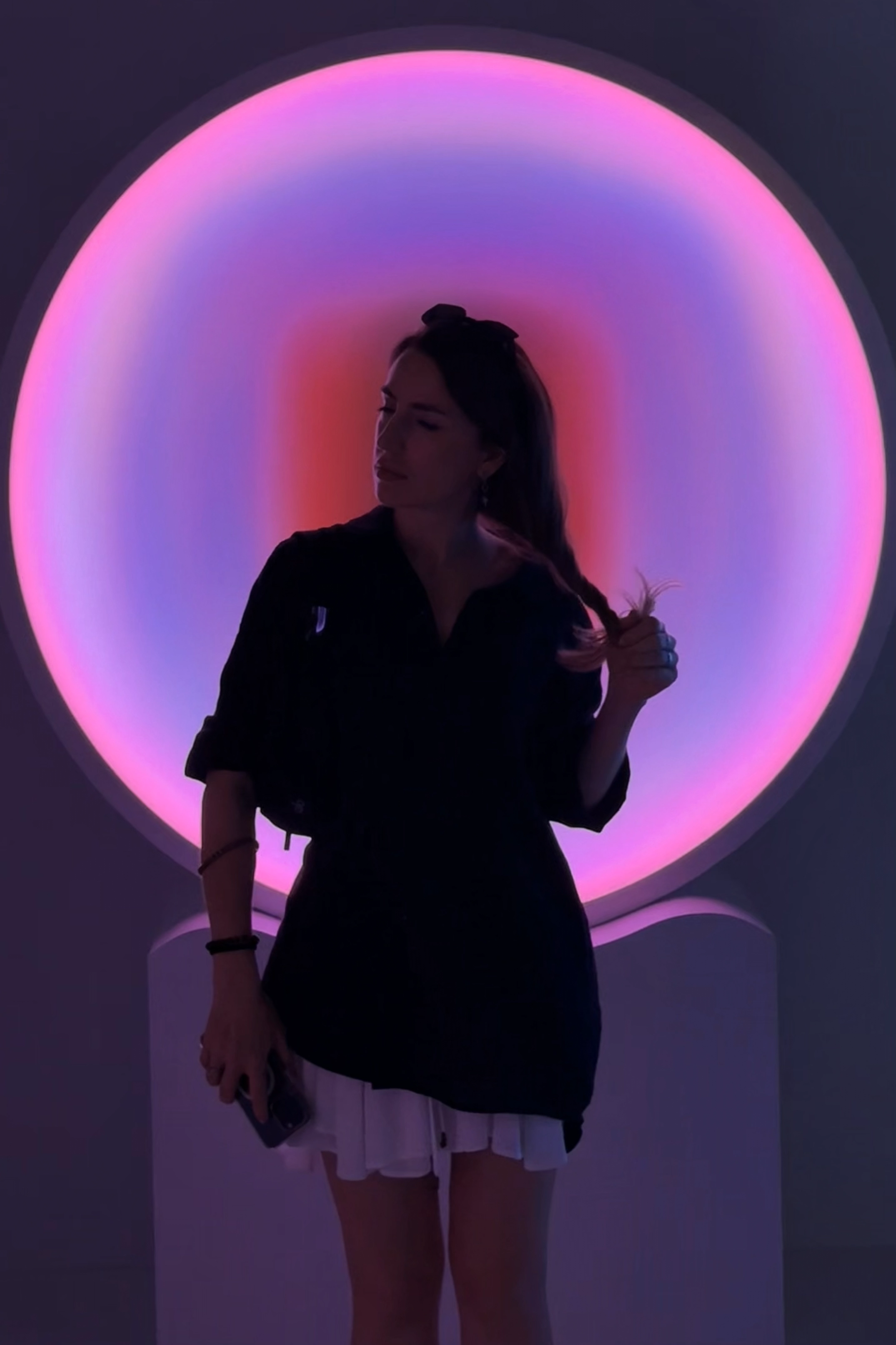
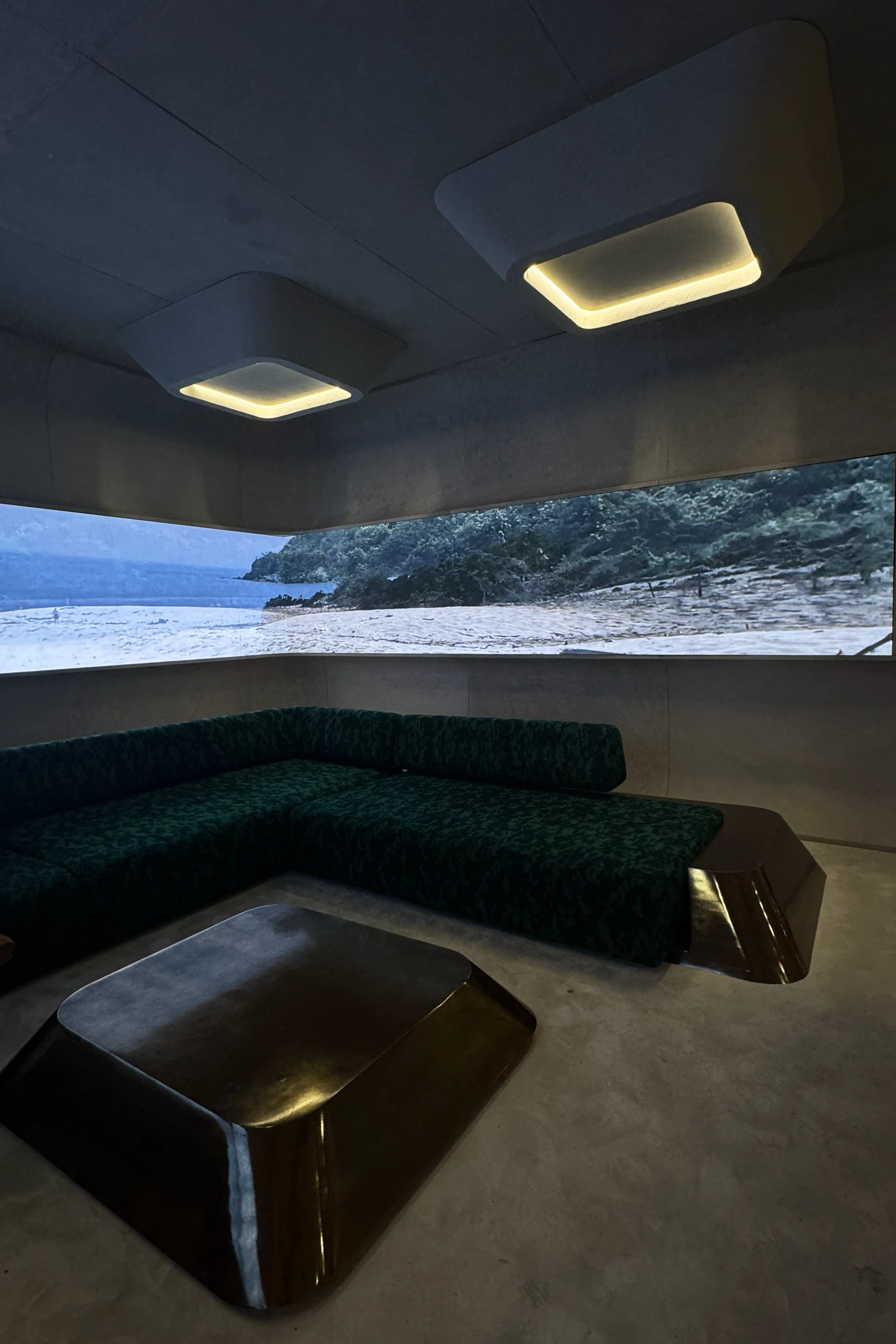
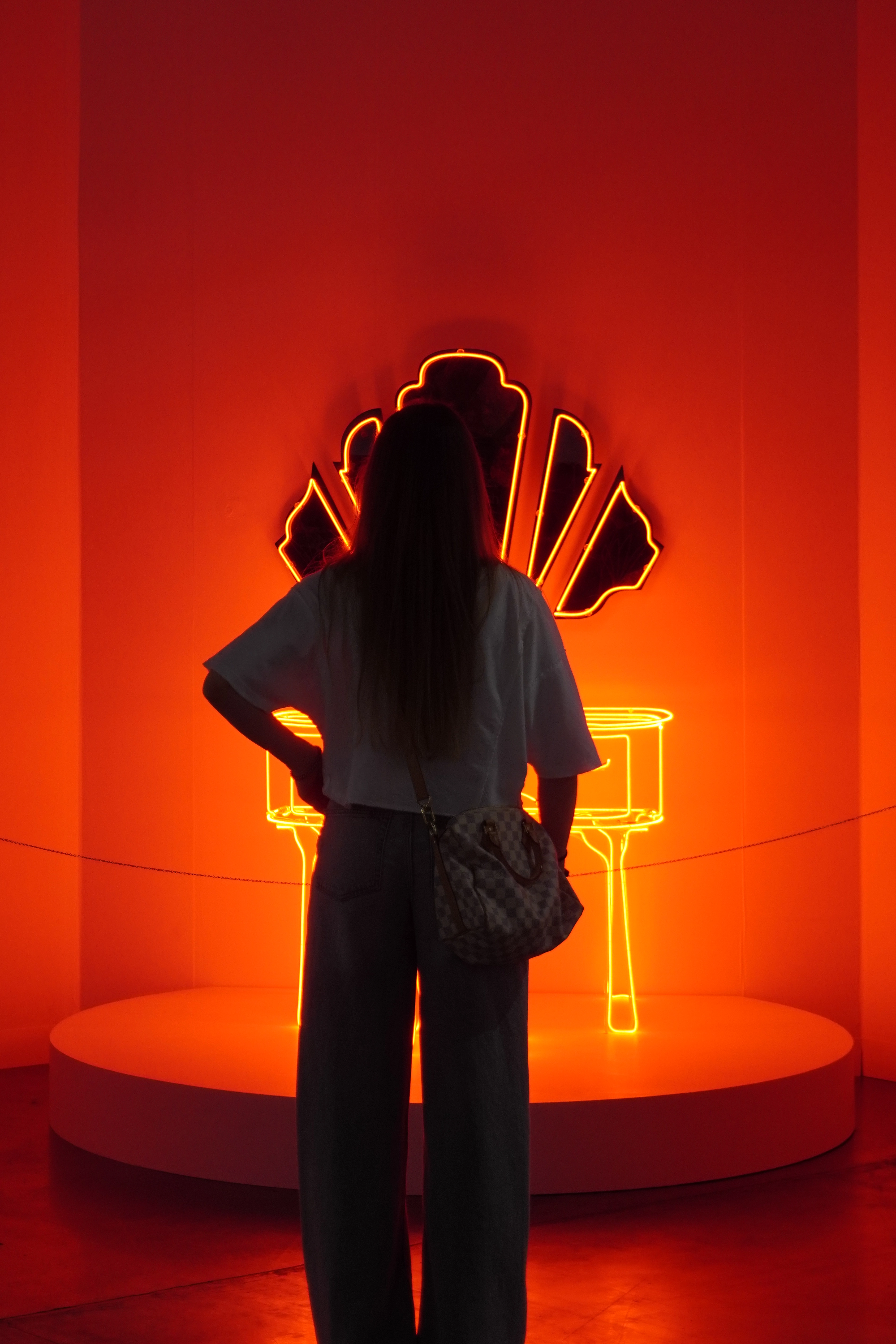
5. Immersion & Meditative Spaces
Interiors as Recovery Environments
One of the strongest macro-signals of recent years.
Across exhibitions, many spaces leaned toward:
darkened rooms
slow, atmospheric lighting
aquatic references
spatial sound installations
rooms of silence
monochromatic immersive environments (blue, red, sand)
Instead of sharp contrasts, these interiors embrace:
muted transitions
cocoon-like atmospheres
The interior stops performing.
It becomes a state of being.
Even wellness equipment is now presented in softer, domestic aesthetics — with textiles, tactile finishes, and an absence of visual aggression.
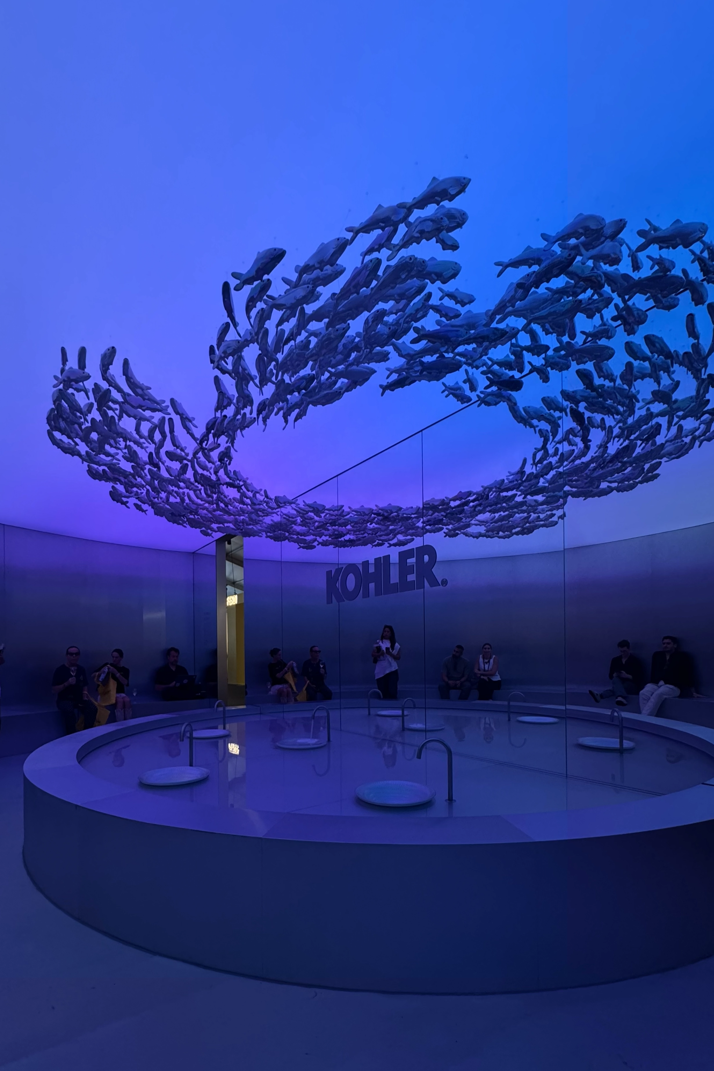
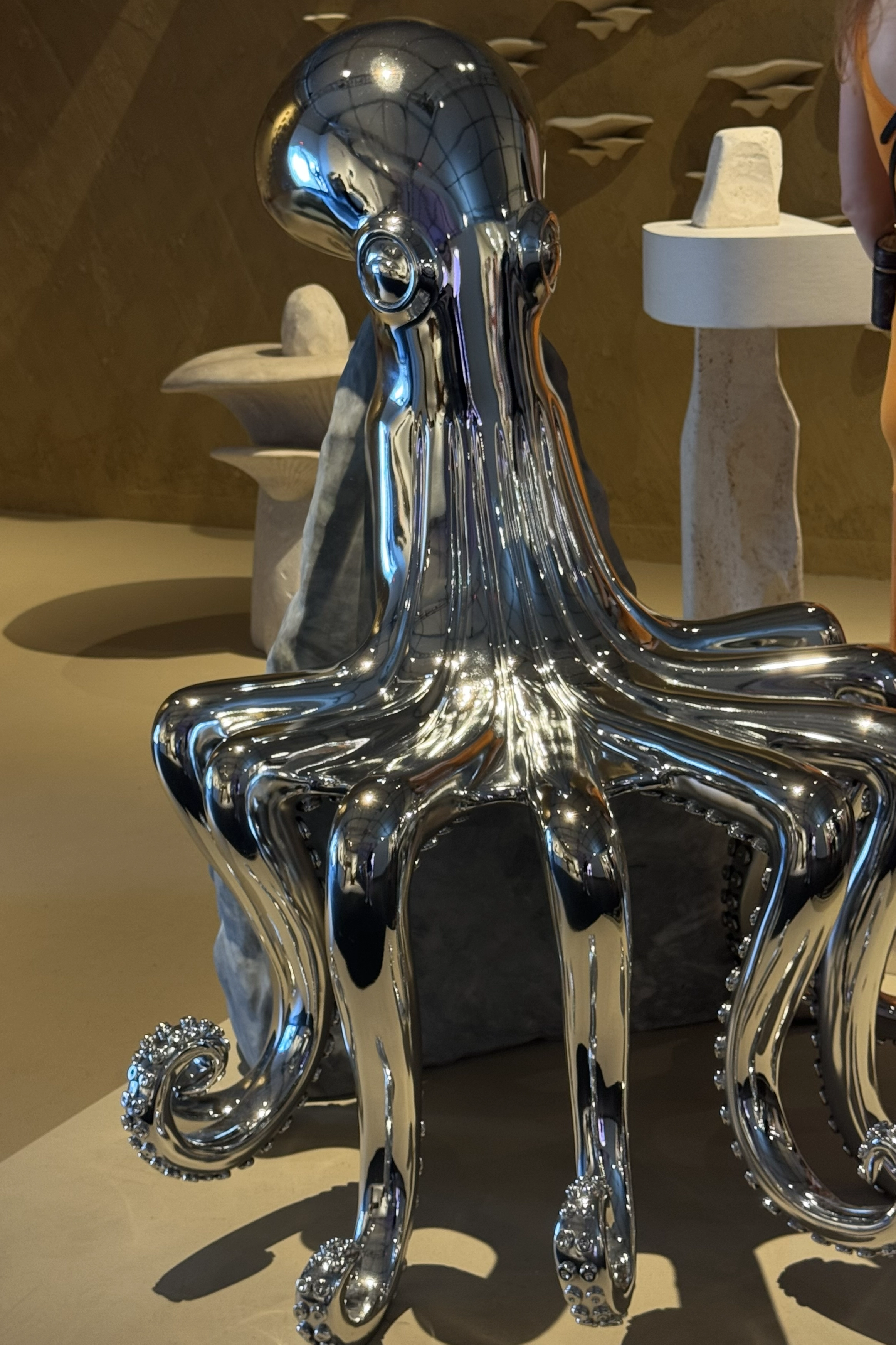
6. Marine Influence — No Longer Just a Metaphor
At Design Miami, marine themes appeared clearly and literally — both conceptually and visually.
Octopus forms, jellyfish, fish, shells, biomorphic objects —
the underwater world stepped out of metaphor and into form.
This is not decorative nautical styling.
Rather, it’s a biomorphic language, where marine life becomes sculpture, lighting, and architectural elements.
Here, the ocean isn’t about vacation.
It’s about depth, fluidity, and life beyond rigid structures.
It’s worth observing how this direction continues to evolve.
But personally — from both an aesthetic and emotional perspective — our studio fully intends to explore a mermaid-core inspired project this year.
7. Heavy Minimalism
Alongside tactility, another quiet but powerful direction is emerging — a desire for grounding.
Minimalism becomes:
heavier
more monumental
more stable
It appears through:
monolithic forms
massive stone volumes
thickened surfaces
furniture carved as if from a single block
This shift seems to respond to a deeper emotional need for stability and permanence.
8. Fog Aesthetic
An aesthetic of state, not form.
Characterized by:
frosted and translucent materials
milky tones
diffused lighting
softened visual boundaries
This aesthetic reflects mental overload and a growing desire for gentleness.
Such spaces quietly say:
You can rest here. Nothing is demanded of you.
No matter how trends evolve — or how tempting it is to follow them — interiors designed around personal rhythm, taste, and philosophy remain timeless. In the end, it’s not the most fashionable spaces that endure, but those that carry meaning and human presence.